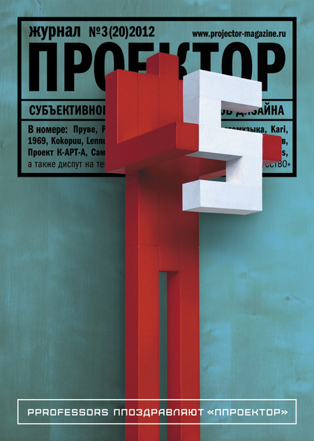
Exclusively for the anniversary issue of Projector, the famous duet Pprofessors — Andrew Lublinsky and Maria Zaborovskaya — have made the Red Man with a Five. Pprofessors ppay anniversary comppliments to Pprojektor. Read the great interview with Pprofessors in this issue’s section #1 «Personification».
We’ve chosen Jean Prouvé, a metalwork genius, to be the historical figure of the main section. Margarita Morozova writes about his life in design and his outstanding objects: «Prouvé never designed purely formal things; the usability, design purity and specificity of materials were always important to him. Prouvé would reveal a practical problem and design solution of every item he created, managing to surround a highly technical object with a peculiar poetic aura».
Exclusively for section «Lettering», I’ve interviewed the American team Friends of Type. The main «pulp» of friendsoftype.com project is non-profit work of the four friends who earn fame and fortune with type and graphic design. Let me introduce these friends of type: Aaron Karambula, Eric Marinovic, Jason Wong and Dennis Payongayong.
We keep exploring the substantive environment together with our partners — the Finnish company Martela. This issue shares the Kari series, named after its inventor, designer Kari Asikainen. He is still a hard-working designer, professor, the holder of numerous professional awards. It is noteworthy that the Kari series received the prestigious award of the Finnish Association of Interior Designers (SIO) as the best item for public spaces in 1982, while the first Kari chairs were designed back in 1969, and for the past forty years the series has become one of the largest collections of furniture for public interiors. Nowadays it is still considered fresh and relevant, which is the sign of a truly timeless classic design of the highest standard.
Pavel Ulyanov, the curator of the Modernariat gallery, managed to recreate a fragment of the legendary office interior of Finnair 1969 at the exhibition Classics of the Finnish design’2012. «The triumph of Finnish design of the sixties was fully reflected in the appearance of the company office. The iconic Ball chairs at the reception, and VSOP chairs for visitors resembling of brandy glasses — all by the designer Eero Aarnio. The airline office staff desks were manufactured by ASKO as a limited edition of six pieces, customized for Finnair by Reino Ruokolainen. It’s even more surprising that I managed to get one of those six for my collection and for the exhibition», — writes Pavel Ulyanov about this memorable piece of design.
Section #5 «Environment» opens with a tremendous publication about a unique construction I saw on my trip to Tallinn. Believe me, even if Tallinn didn’t have anything except the seaplane shed, it would be still worth going there. «The story of this grandiose construction began in late 1913, when Emperor Nicholas II issued a decree to start building an airport which was to become a part of the naval fortress of Peter the Great (now Battery Fortress). Six thousand square yards of land were allocated for this purpose. In accordance with the fortification plans of Tallinn, approved by Nicholas II in 1911. Now the hangars have been reconstructed and turned into one of the most amazing museum grounds».
Another noteworthy environmental object, caught into the spotlight of Projector, is the hilarious and lively antae temple, which the creative team «Lesosplav» (Alexander Berzing, Andrey Voronov, Georgy Snezhkin, Eugeny Novosadyuk and Innokenty Padalko) invented and built of hay bricks. Early at dawn, the architects came to the object, already built up to the roof, to add the final architectural details, and scared a couple who were selflessly making love on the hay brick floor — a classic situation of love pleasures in a hayloft. Such a usage of an ancient temple is customary for the traditions of the Hellenistic period. And the guiltless intercourse of the unknown guests became a symbolic act of converting the environmental object into a religious building — the true temple of love.
Section #7 «Photography» tells the story of the works by Victor Schurov (1955—2005), an amazing artist from St.Petersburg. Natalia Savotyugina, Alexander Lyashko, Alexander Koksharov and Alexander Nasonov recall their friend and colleague: «He had a special gift to gain people literally after a few minutes of a dialogue. Everything Shchurov was interested in became interesting to everyone around. That was Victor who old ladies at the crossroads asked to take them across the road, despite his beard and tattoos. And his photos exposed his inner essence. If you can read an image, you can’t help loving this person — everyone loved him».
In section #8 «School», our regular contributor Sergey Helmyanov explores the legacy of Nikolay Slesarev, the designer and teacher at the Stieglitz Academy: «As we are always living in „interesting times“, it’s not surprising there isn’t a design museum in Russia to collect, preserve and popularize Russian design. There’s an opinion that we don’t have and have never had any design, and priceless objects and their authors remain in complete obscurity. Nikolay Slesarev’s studio still houses the projects that should be actually kept in a museum».
I’m also very happy to share the works by Maria Portnova, whose thesis project, created under the supervision of Konstantin Startsev, I reviewed this summer. «Maria’s posters made my heart beat faster. Using a very low-key color palette in local accents, and generally limiting herself with almost a monochrome solution, she demonstrates the professionalism of a virtuoso typographer and composer. The combination of professional graphic language with the subtlety of embodyment and the deep ideological component — that’s what distinguishes a truly outstanding performance. The posters may very well live their own exhibition and gallery life, being a remarkable example of graphic art.
Section #9 «Book» turned out to be the richest one. It opens with the traditional Mikhail Karasik’s publication on the history of books of the 1930s. «Due to its pictorial language, involving photo illustration scenes with men and beasts, designed by artists, this is one of the earliest examples of a book for children, made in the manner of a cartoon. In its first issue, which was a kind of announcement in the magazine Novy LEF (#1, 1927), it reads Photoanimated illustrations to the children’s book „Samozveri“ by S. Tretyakov».
There’s a new sophisticated graphic volume from Yury Gordon. This time, the artist’s book is dedicated to Daniil Kharms. Our expert Alexei Boiko: «Gordon has been piqued by Kharms, skillfully using his poisonous bites and intoxicating effects, to awaken and demonstrate his language tuning, the voice stream, the literature world. Not the illustration by Harms, but the implicit competition with him becomes the essence of the project, and in the dialogue, in the fight against the forefather Yuri Gordon uses designer and artist’s authoring tools of unique quality and variety. The idea of sophisticated and vital pairing types of his own design with man-made characters and pictograms didn’t strike his mind… Y.G. is as creative as D.K. — and he’s more efficient, successful, more of a winner».
Stanislav Savitsky speaking about the book Architectural constructivism of Leningrad: «It is a strange book. It is a large format with a solid aluminum cover, cumbersome, heavier than lots of other books. You won’t be able to get to look through it on your laps. To explore it, you need a large table, and you’ll have to stand in front of it, as while sitting you’ll not see the entire spread. You need an effort to turn the hefty cover, and flipping cardboard pages of large format requires catching the trick. This volume wants special attention, as if it were a facsimile edition of an ancient manuscript, like Herbarium by Linné, or an old family album. It’s a designer book, which immediately reveals its author as a person, keen on the Soviet constructivism».
And at the end of the anniversary issue, there’s the third «ProArt». The artist Alexander Dashevsky and I asked tricky questions to the representatives of the leading art galleries in St.Petersburg. We interviewed: Liza Savina, the manager of Al Gallery; Anna Barinova, the art dealer and the owner of Anna Nova gallery; Diana Brat, the executive director of the gallery ART re.FLEX; Fedor Serdyuk, the art dealer and the owner of ART re.FLEX; Andrey Sakov, the curator of the gallery ART re.FLEX; Marina Koldobskaya, the director of Cyland Media Lab; Pavel Ulyanov, the curator and co-owner of the gallery Modernariat. The conversation was really fun and informative. No surprise — we had such experts in the studio!


