Mr.Doors is a well-known Russian company that has been manufacturing cabinet and built-in furniture since 1996.

For 24 years, the Mr.Doors logo has not changed and has been the embodiment of excellent design work, the main theses describing the past logo are modularity, originality, recognition. But time passed, priorities changed both in the company itself and trends in graphic design. Semantic detailing has been replaced by abstract, humanistic minimalism. The company’s communication with the consumer has become simpler, along with communication, the visual language in which the company speaks with its customers has also become simpler.

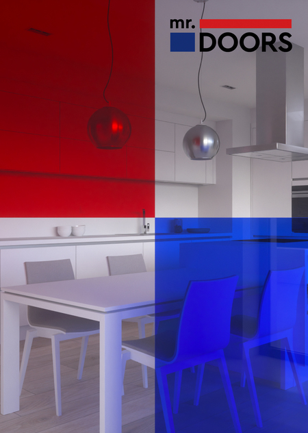
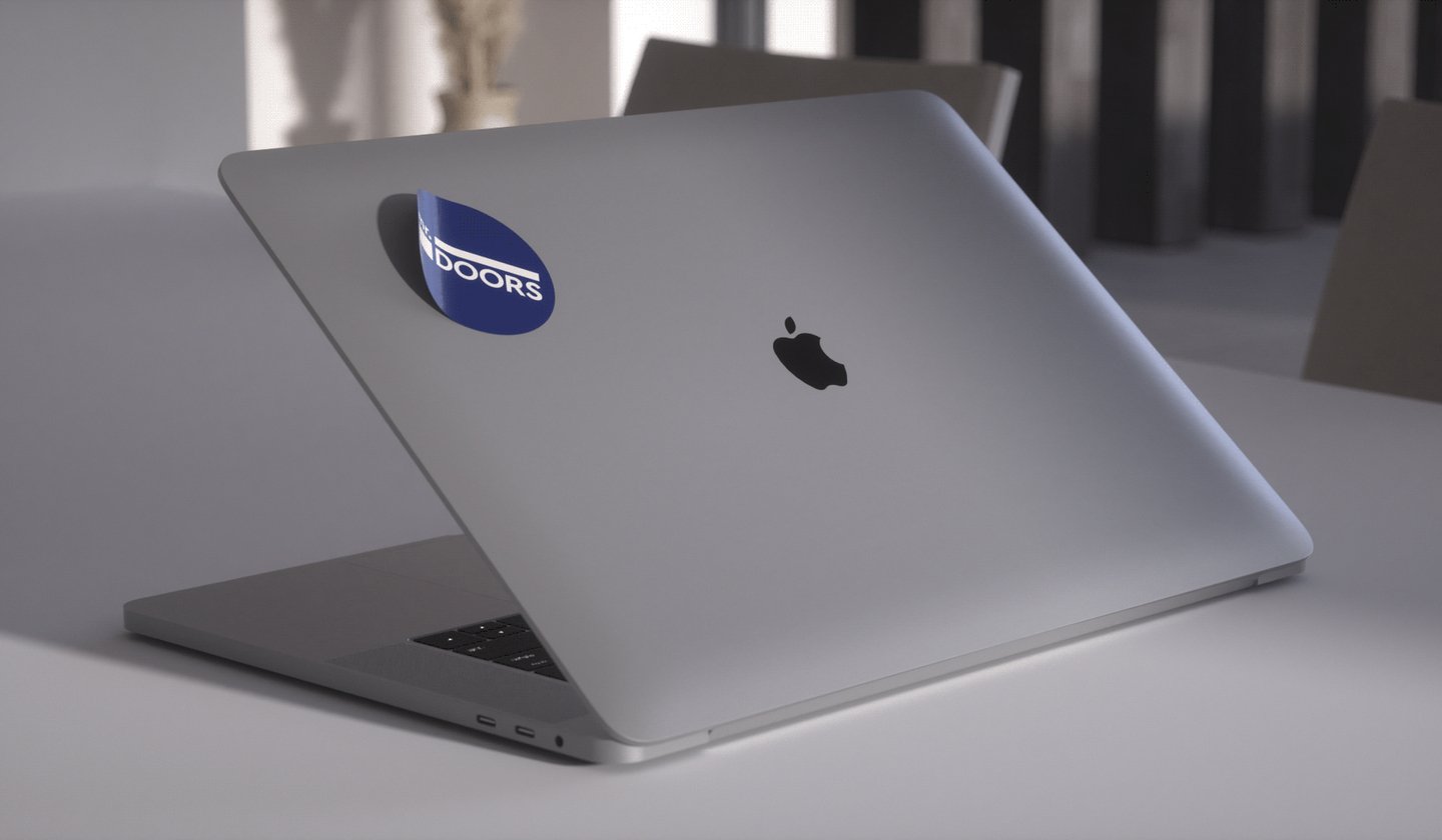
It was decided to change the visual image of the company. We have developed a new logo that retains the successive features — a modular structure and the main corporate colors. We have thought of several options for the layout of the logo, which are used depending on the medium: the main vertical version, the horizontal version for signs and entrance groups, the simplified version for very small formats. The main element of the new Mr.Doors corporate identity is colored glass, which symbolizes transparency and colorfulness. Blue and red solids are integrated into printed products and image materials, color overlays, transparency, full-size images — the new graphic language of Mr.Doors for the coming years.
Original size 1680x980
Mr.DOORS
Григорий Хромов разработал новый логотип для компании Mr.DOORS, сохранив модульную структуру и основные корпоративные цвета. Новый корпоративный образ включает цветное стекло как символ прозрачности и яркости, а также несколько версий логотипа для разных форматов.
Project description created with AI
Project created at 18.05.2023
More projects in identity & branding
Екатерина Алещенко создала архитектурно-дизайнерскую мастерскую ТАФ, объединяющую педагогику, проектирование и творчество в одном пространстве. Проект включает издание книг, поэзию, фотографию и театральные практики, основанные на принципах естественности и соединения традиции с современностью.
Алина Молчанова создала упаковку и рекламную кампанию для магазина товаров для дома PTICA. Проект включает лимитированную серию упаковки к масленице, разработанную специально для бренда.
Алина Молчанова создала четыре концепции бренда для традиционного русского северного сувенира «Птица счастья». Проект включает в себя варианты стиля, такие как птица счастья, горизонт, небо и последовательность.
Иван Ветров создал айдентику для арт-центра «Варочный цех» в Мытищах, который функционировал на территории завода Московской пивоваренной компании. Проект включал разработку брутального логотипа с элементами пивных танков и альтернативных символов шрифта для коммуникации.
dva.design
Multidisciplinary design agency that works in partnership with the deziiign platform and HSE DESIGN LAB. dva.design offers services in all areas of design — from branding and illustration to object and product design, environmental and interior design. The uniqueness of our expertise lies in solving multidisciplinary problems — between graphics and architecture, between fashion and communication design, between books and exhibition design.... Show more
We use cookies to improve the operation of the website and to enhance its usability. More detailed information on the use of cookies can be fo...
Show more