«Doctor, thank you for having cured me of megalomania! How many millions of dollars do I owe you? ’ Well, I decided to put a photo of me onto the cover. Let everyone say Kharshak has gone crazy. This is me who established this magazine, I am publishing it, and I’m here as the chief editor, so my face is really supposed to decorate the magazine. And if someone doesn’t see self-irony in this cover, it’s not a problem of ours».
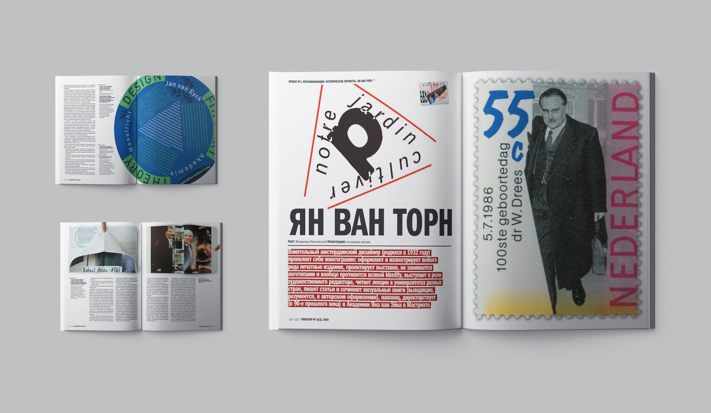
The issue opens with the publication about Jan van Toorn. Vladimir Krichevsky — an encyclopedist, erudite, and an expert in graphic design, has written a wonderful text, and provided unique illustrations from his archive. «The influential Amsterdam designer (born in 1932) expresses himself in a lot of ways: he prepares and illustrates any kind of issue, designs exhibitions, does not deal with logos and generally avoids all the identity, acts as an art director, teaches lectures at universities in different countries, writes articles and composes visual books (of course, coming out in the author’s design), and finally, he’s the head of Jan van Eyck Academy in Maastricht in the 1990s».
The real troublemaker of this issue is Anna Naumova, who has imposed her own ruffian publication. The column «Self-service», where invited guests design the spreads on their own, has become the focal point of the magazine. Besides, I, as the editor-in-chief, have set myself severe restrictions — I have no influence on the layout. It is entirely the author’s work. Anna is the third protagonist of Projector, after Boris Trofimov and Vladimir Chaika, who has designed the publication on themselves. The text part of the article was the interview we took with Anna, when she came to St.Petersburg to perform in the VIZHU! program.
The project City of N is represented in the section «Russian Design» by Olga and Alexander Florensky. The project includes: a palace, an observatory, a post office, a lighthouse, a water tower and other unique design objects.
Alexey Dombrovsky continues the story about Sergey Chekhonine. «Type is very likely to have been the first graphic work, conceived and prepared for printing by Sergey Chekhonine. More exactly, it was a very imaginatively decorated alphabet. There’s nothing to see now: after all, it wasn’t brought into circulation, and the original has not been preserved. There’s only a brief mention of it in the long article by Vladimir Botsyanovsky, but the author mostly admired the civil courage of Chekhonine’s first typeset, rather than the manner of its execution. However, it is not surprising: after all, the artist drew not a usual, but the „revolutionary“ ABC — a caustic satire about the governmental system.
This time we’re sharing the three magnificent examples of decorative lettering, and the investigative report of where they stem from: «In the lower right corner of the cards with the signs „S“ and „K“ (which probably can be attributed to Latin rather than Cyrillic) there’s the stamp Mustershutz — a kind of of protection against forgery. At the same time on the card with the letter „L“ (a Cyrillic grapheme uncompromisingly!) there is no such sign. This allows me to assume that the originals are the cards with the Latin letters, and a Russian publisher ordered local designers to adapt the series for the Cyrillic alphabet.
The section «Object» opens with our traditional column, which comes out with in cooperation with Vitra. Here we talk about the outstanding design objects of the XX century. This time it’s the Freeform couch by Isamu Noguchi. «Isamu Noguchi is the author of the Freeform sofa, and more of a sculptor rather than a designer in the traditional understanding of the profession. Nevertheless, furniture, light, buildings and scenery decorations have been constructed to his designs since the 1950s. He implemented a sculptural and artistic approach into every project of him».
«Environment» features amazing constructions by the bureau BIG. This is what our contributor Ivan Kulikov writes about them: «If you carefully look at the project solutions BIG makes, you’ll have no doubt that new Danish architecture is conceptual and circumspect: the residential complex VM with an unusual building called The Mountain is a distinct confirmation of this. The futurist shape of the buildings is the result of the synthesis between the concepts of sustainability, simplicity, clarity and uniformity of urban housing. Danish idyllic suburban life gets a new development in the urban environment».
Perhaps the most consistent and solid within the magazine, section «Photography» shows magic and romantic nudes by Andrey Medvedev. The text of the article was written by Alexander Florensky, who knew the author: «Andrey, like many artists, used to take some pictures now and then, but he seriously took up photography in the last ten years of his life. His favourite technique became incredibly laborious acacia gum printing, when it takes a few days to create a single print. Unfortunately, this is a posthumous publication of Andrey’s works. He died on July 27, 2010, when we were still working on this issue».
Section #8 «School» keeps sharing the works by the students of Konstantin Startsev. «The works by Startsev’s students have always featured these two amazing qualities: emotionality and sensationism. What a thick stream of energy pours onto the audience out of them! Undoubtedly, these are the artworks of the highest standard. These lettering and beauty-of-the-type studying tasks, embodying a Letter with a variety of materials and techniques, don’t bear any functionality at all. It’s a purely spiritual practice like meditation».
We continue to study the recent history of design periodicals in Russia. The issue’s protagonist and the founder of Russian graphic design Sergey Serov on the history of the magazine: «Our country is rich in talents and paradoxes. If you run a magazine, it is not so much about the design but the designers. Those who achieve success not because of, but in spite of everything. Same happens in every field of design: graphic, industrial, environmental design, fashion design, and… The magazine could be a joint between different genres, types and forms of project work. I suggested the name Guild of Designers, attributing its meaning primarily to intraprofessional communication rather than the Union as an organization of designers. Oddly to say, I was given carte blanche».
Vladimir Krichevsky not only opens the issue with his publication about Jan van Toorn, but also kind of closes it. Under the heading Projector recommends, Vladimir Yefimov and Anna Shmeleva meticulously examine the new edition of the famous diptych «Typography in terms and images» by Vladimir Krichevsky. «Of course, any review is inconceivable without its critics. And now, paying tribute to this tradition, let’s just say that this is a very good book. It’s great that it’s come out, and even greater that it continues existing and developing. In short, we strongly recommend it!»


